Spinaway

On-demand laundry service app

STRATEGY
BRAND IDENTITY
DESIGN SYSTEMS
UI/UX
WEB DESIGN
WEB DEVELOPMENT
Produced in 2022 @ Paloma Group
THE PROJECT
[ 01 ]
Laundry is one of the last domestic tasks that hasn't been disrupted. No app, no platform, no on-demand solution existed for it until Spinaway. An Australian service connecting people with local laundry providers for pickup, wash, fold, and delivery.

Build a brand as frictionless as the service itself.

Spinaway logo featuring a stylized washing machine with a smiling face and legs next to bold blue text 'Spinaway' on a light pink background.
THE CHALLENGE
[ 02 ]

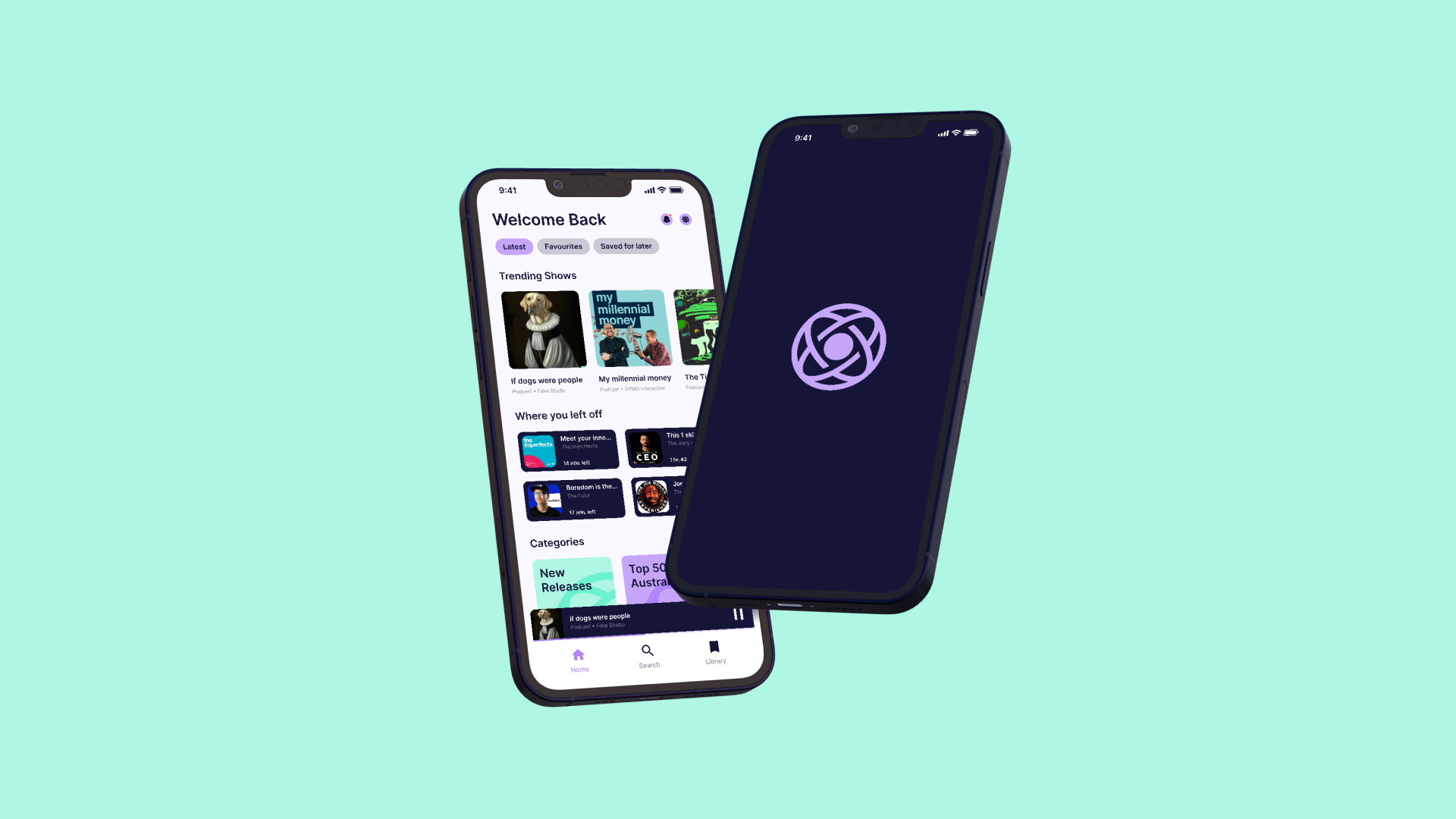
The category didn't exist yet, which meant the brand had to do two things simultaneously, explain what Spinaway is and make people want it. In a space defined by mundane necessity, the design challenge was to make laundry feel like something you'd actually look forward to handing over.

Turn a chore into a choice. Make the invisible feel inevitable.

Text reading 'Life Without Laundry' in bold light purple on a blue background with two small washing machine icons.
Two app icons labeled Spinaway and Spinners showing a stylized smiling face in a rounded square, and an iPhone screen displaying the Spinaway app icon among other default apps.
THE MASCOT
[ 03 ]
Every great consumer app has a character. Tumbles is Spinaway's, an expressive washing machine with a personality elastic enough to carry the full range of the brand's communication. Delighted when your order is placed. Impatient when it's running late. Triumphant when it arrives. Tumbles makes every touchpoint feel human.

Multiple expressions. One character. A personality that scales with the product.

Blue computer monitor character with smiling face and legs above the text 'Meet Tumbles' on a light pink background.
Twelve simple white emoticon faces on blue background expressing emotions: Happy, Delighted, Bewildered, Sad (with tear), Sly, Cheeky, Excited, Wince, Impatient, Unimpressed, Wink, and Puffed (with sweat droplets).
VISUAL IDENTITY
[ 04 ]
The identity system was built around joy, not utility. Bubble Pink and Washer Blue as the palette anchors, warm and playful, distinct from every competitor in the category. The Gustavo Bold typeface carries the same energy as the mascot: bold, friendly, impossible to ignore. Every element was chosen to make laundry day feel like something worth celebrating.

A vibrant system designed to make the mundane feel magical.

Six color blocks labeled with their names and codes: Bubble Pink with hex #FFE5F8, RGB 255/229/248, Pantone 9320C; Washer Blue with hex #3244EA, RGB 50/68/234, Pantone 2728C; Off White with hex #FCFCFC, RGB 252/252/252; Off Black with hex #1B1C22, RGB 50/68/234; Water Blue with hex #BEECFA, RGB 190/236/250; Power Blue with hex #23388A, RGB 35/56/138.
Spinaway brand guidelines pages showing logo usage, typography, color palette, brand values, and mascot Tumbles on blue, pink, and black backgrounds.
Typography sample showing 'Gustavo Bold Take a load off' in bold font with alphabet, numbers, and symbols on blue background.
UI DESIGN
[ 05 ]
The product experience was designed like a game, bright, rewarding, and surprisingly satisfying to move through. Animations, vibrant micro-interactions, and a reward system made the act of booking a laundry pickup feel like an achievement rather than an errand. Tumbles guided users through every step.

If you have to do laundry, you might as well enjoy the app.

UI design sample showing various button styles, badges, checkboxes, star ratings, toggles, tooltips, toast messages, and order-related information cards.
Billboard advertisement with blue text 'Enjoy Life Without Laundry' and a hand holding a basket of folded clothes with a rainbow above it.
Three smartphones displaying Spinaway Instagram stories about laundry, including messages: 'We have just started spinning in Sydney,' a user quote, and 'Over 100,000 hours saved in Laundry.'

Credits

Executive director

Lee Corleison

Design director

Rob Dennis

Design team

Dillon Ramesh, Luke Summerhayes, Maisie McDonald

Brand, identity & direction

Luke Summerhayes, Rob Dennis

UI / UX design

Dillon Ramesh, Luke Summerhayes

Web design & development

Luke Summerhayes, Rob Dennis

Animation / motion graphics

Luke Summerhayes, Maisie McDonald, Rob Dennis

Illustration

Rob Dennis

Extended team

Alejandro Tunaroza, Daisy Cox, Daniel Gibson, Harry Luxton, Jojo Stewart, Nicole Wilcox, Nike Wakelin, Poppy Trewhella, Rafe Custance, Roy O'Connor, Sebastian Cox, Steph Schaffer, Sydney Crocker, Trish Trainor